Not getting in the users way

With KDE 4.13, nepomuk and its associated soprano/virtuoso database and storage frameworks has been replaced by something called 'baloo'. The developers are confident: 'There is no explicit “Enable/Disable” button any more. We would like to promote the use of searching and feel that Baloo should never get in the users way.' As a result, the users have high hopes. Is it possible that we finally get a fast desktop search without excessive consumption of resources?

My ~/ occupies a mere 60 GB, and not even half of that are actually indexable data [which I would expect an intelligent desktop search without any possibility of configuration (!) to detect]. All of these data reside on an SSD with a readout speed of 0.435 GB/s, and I have 16 GB of RAM with an access rate of 1.6 GB/s. I would expect a high-speed indexing algorithm (which baloo is supposed to be) to be able to index my drive in not more than 15 min.

What I (and many others) observe instead is a 100% CPU load (on one core) over an extended period of time with a truly horrendous memory consumption. In my case, I've waited 4 hours in which baloo occupied 6 GB RAM on average, with peaks reaching 14 GB. The index created was finally threatening to become larger than all my files combined.

To switch off that amok-running bear, I actually had to search the web. A cleaning process was started after that, again causing full load on one core for several hours. This process left me with an inactive index of 1 GB size.

WTF is wrong with the KDE developers? If that's their idea how to "not getting in the users' way", I really wonder if my infinite patience with them was not just a complete waste of time.

I have two systems running on openbox already. I could imagine having two more.

Conversion

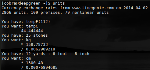
The SI system has been published 1960, but many incorrigible physicists (particularly the theoretical ones, shame on them) still use the CGS system. Manually converting expressions from one system to the other is one of the most dreadful (aka boring) thing in a physicist's life. As a PhD student, I did exactly that day in, day out. As a postdoc, I discovered ye olde units. Just like graph, this wonderful tool is essentially unknown to modern Linux users, but very useful not only for physicists. Or can you tell me right away (and with reasonable accuracy!) what's a 112 Fahrenheit in Celsius, a 25 stones in kg, or 12 yards, 6 foot 8 inch in cm? Voilà:

Extract bitmaps

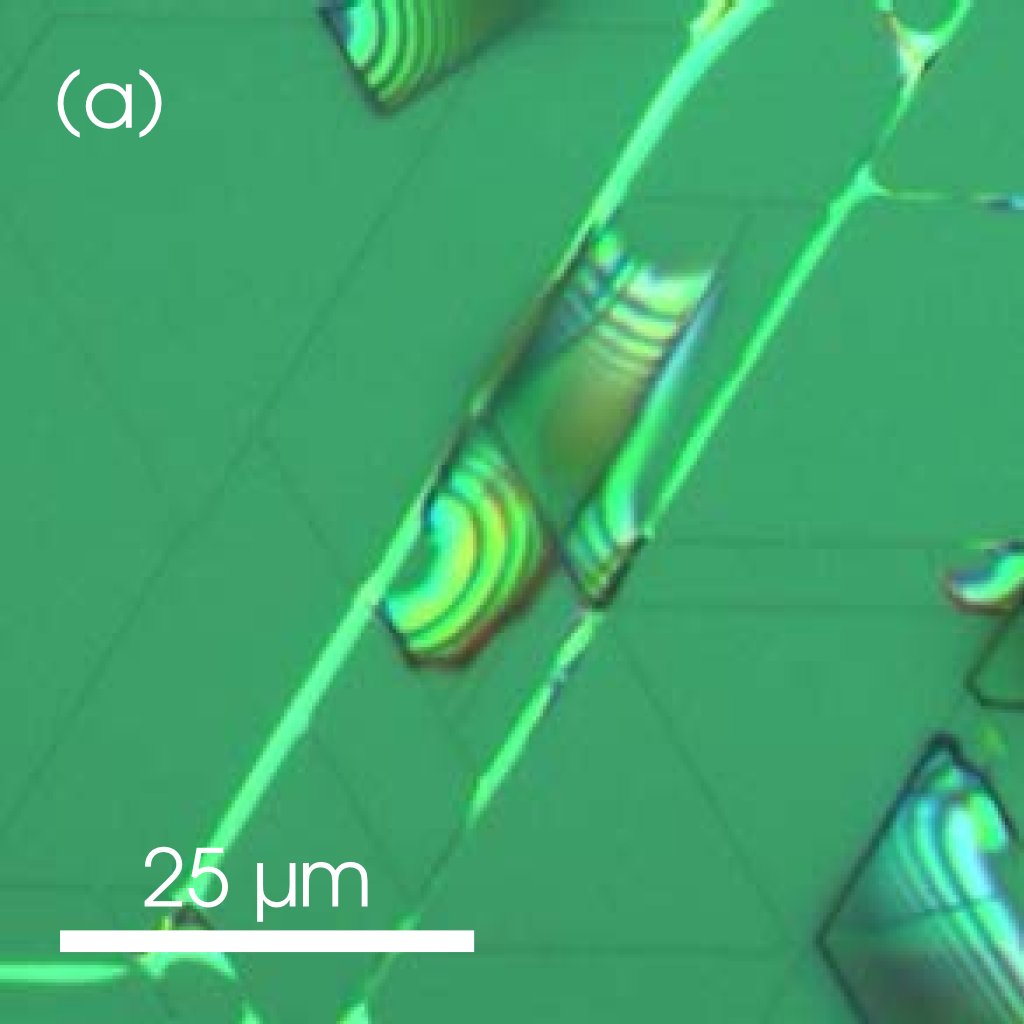
Basically the opposite of the procedure I've described in a previous entry, and potentially (!) very useful. 'mutool extract paper.pdf' extracts all bitmaps in paper.pdf (as well as all fonts, which are not of interest here), and one thus gets the raw images without any of the artwork added to them for publication.

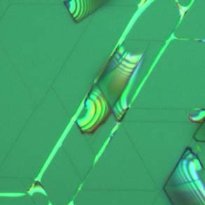
Here's a real-life example taken from this paper.

original figure extracted bitmap

Unfortunately, this procedure only works if the publisher actually includes the submitted vector graphic files, and not screenshots of them. No, I'm not kidding. Using 'mutool' on several dozens of publications, I found that many (if not most) publishers actually convert the submitted eps files into bitmaps, including low-quality jpegs.

Now, you can call these publishers ignorants (and rightly so), or even cretins, dipshits, imbeciles, idiots, morons, or whatever qualification you would like to emphasize. But remember that we usually pay them handsomely to get our work published in their journals. Now who's the idiot?

'mutool' is part of mupdf, in case you were wondering.

Résumés and indices

I receive a constant flow of applications for PhD student and postdoc positions. A quick check of my trash folder in kmail reveals that the number of applications over the past 4 month is at least 27. Including the 3 I didn't trash, this number means that I receive about 90 applications per year.

Fortunately, I don't have to spent much time (<10 s) with most of them. Over the years, I established the following policy:

(i) If the application is not send to me, but to unspecified recipients: trash it.
(ii) If the cover letter starts with 'Dear Professor' without explicitly referring to a specific person, or with 'Dear Professor Paul Drude' and thus referring to the wrong guy, or with 'Dear Professor Braudd' or any other sad imitation of my actual name: trash it.
(iii) If the cover letter has no reference to where I work, or what I do: trash it.
(iv) If the cover letter contains several grammatical or typographical errors: trash it.

If the applicant has come that far, I will at least send a brief mail informing him or her that we don't have a position available at the moment. In the unlikely case that we are indeed looking for somebody at this very moment, I'll have a quick (!) look at the attached résumé or curriculum vitae. What I see then is often pathetic — poorly formatted Word files with more grammatical errors and typos than you'd expect even from a mediocre high school student — and rarely informative: Chinese applicants frequently refer to their role as 'model student of the year' and their perfect command of the English language, while their Indian counterparts seem to view their enthusiasm for cricket as essential information.

In some cases, however, I'm pleased by what I see. An astonishingly high number of these outstanding cases are prepared by applicants in German-speaking countries using the 'moderncv' class of LaTeX. This choice not only guarantees a well-structured and aesthetically pleasing résumé, but is also certain to register as a proof that the applicant has no problem dealing with LaTeX (which is definitely a plus in the natural sciences).

The disadvantage is that applications based on moderncv in its default configuration all look the same, and lack any obvious individual characteristics. For me, that's such a serious drawback that I do not use the moderncv class for my own résumé but instead still the one I've improvised 25 years ago based on the article style and doing all formatting with the tabbing environment. Now, I'm not looking for a job, but I still need to attach my résumé to project applications, and at times I'm musing about how nice it would be to start from scratch and base my résumé on a more modern foundation.

Well, at a lazy afternoon I searched the net and came across several interesting templates for a résumé or curriculum vitae. Technically, the template provided by Adrien Friggeri is very attractive: it employs TikZ for the header, XeTeX and fontspec to use an arbitrary otf font, and biblatex/biber to automatically print selected sets of publications. The design is on the edge of being extroverted, but that's easy to change.

I'm currently playing a little with this template, and I'm really enjoying it. In particular, it never fails to impress me how much we can compress information in the digital age. We can put a world into a single link, and I wonder why I don't see that more often in applications from young (and thus 'digitally native') researchers.

Here's one example:

All of the lines following 'about' are active links when viewed in a pdf reader. They show my identity as researcher from different perspectives, but foremost, they list my publications and citations. What could be more important?

Here's another:

Only one link, but an important one. And certainly, I would treat an application offering explicit values of the publication indices very favorably. 😉

What are these indices? Well, they are more or less smart attempts to compress the 'value' of a certain scientist's research into a single number. The most popular and prominent one is the h index, which is criticized for several reasons, among them the fact that it can be obtained from the number of citations (in my case, the agreement is almost perfect). The g index does not have this weakness, but is more difficult to estimate (I use a script for that). Finally, the i10 index has been created by Google in the attempt to promote its Google scholar service. It's determination is trivial and essentially serves to distinguish wheat and chaff.

None of these indices is free from weaknesses, and none of them alone provides a reliable impression on a researcher's performance. Taken together, however, these indices can reveal much.

As an example, let's compare my indices to those of a valued colleague of about the same age: Steven C. Erwin. At the time of writing, his h, g and i10 indices are 37, 79, and 77, respectively. Evidently, the first two of these indices are close to mine, but his i10 index is drastically lower. Hey...that looks good for me, right?

It doesn't. Nearly equal g, but vastly differing i10 indices simply signify that the guy with the lower value for the latter (i.e., Steve) is more efficient: he publishes less trash which is immediately forgotten.

If I would have to chose between Steve and me, I would take him. Fortunately, he's a theorist, and thus not of much use for anything. 😄
Goodbye Windows

Because of my depressing experiences when trying to connect to our Cisco-based VPN under Linux, I've so far used a virtual Windows XP and the IPSec 'vpnclient' from Cisco. Since the end of Windows XP is nigh, I had to find an alternative.

In the meantime, we have enabled SSL support on our Cisco ASA to allow users running a 64 bit Windows 7 to connect to the VPN using the Cisco 'AnyConnect' SSL client. Of course, acquiring a Windows license just to connect to the VPN was not an option for me. I would either be able using open-source software or not be able to connect at all.

I've quickly found that 'openconnect' is held in high regard in the interwebs, and decided to give it a try on a virtual Debian Jessie:

su -
wajig install openconnect
openconnect -c certificate_bundle.p12 https://gateway.de

Bang, connected, and all services work.

Unbelievable! Finally!

I've found that the direct use of the PKCS#12 certificate bundle works with Debian Jessie, but not with Arch, for which the certificate bundle has to be split into the x509 certificate and the pk8 private key in pem format using openssl. But that's perfectly ok, since I anyway value the convenience of connecting to the VPN with a virtual machine without the necessity to disrupt my standard connection to the internet via QSC.

Stability

When we say that a particular version of an operating system (OS) is 'stable', we actually mean that its application programming interface (API) and application binary interface (ABI) will not be changed within the lifetime of this particular version of our OS. Granted, that's a programmers' definition, but that's what stability means for any IT professional.

For the ordinary user, 'stable' has an entirely different meaning. For him, this attribute signifies that the OS and all applications installed under it run smoothly and don't segfault. Conservative users valuing this virtue tend to use Debian Stable or Slackware, and they also tend to confuse age with stability.

I was surprised to find the same attitude where I would have least expected it: in a discussion about Manjaro, an Arch-based Linux distribution. Manjaro is currently hyped similar to Ubuntu a decade ago, and is explicitly praised for having an own packaging system (unlike ArchBang, for example). Official Arch packages are held back in a 'testing' repository for an indefinite time (typically a few weeks) until they are deemed to be fit for the 'stable' repository.

Allan McRae has criticized this 'feature' repeatedly, and rightly so. Delaying critical updates to create the impression of a well-tested, 'stable' computing environment is a very cheap marketing trick, but one which seems to work well judging from the comments to Allan's blog entries.

Vector screenshot

I just had to prepare a poster based on roughly 30 publications, and for several of them I didn't have the original figures but only the manuscript as a pdf file. Using okular and a magnification of 800%, I've got screenshots of these figures as comparatively highly resolved bitmaps, but the price I had to pay was that the editing of the poster in LibreOffice (which I've used as the least common denominator) was getting almost unbearably slow.

I couldn't silence the thought that it should be possible to take a 'vector screenshot' from a pdf file. I had the vague idea that pdftocairo could be useful in this respect, since it can output arbitrary parts of a pdf file as pdf or svg. And it turned out that Peter Williams, a young radio astronomer from Harvard, had the same idea and came up with a script which does exactly what I wanted.

I've fixed a small error (pageh should also be an integer) and ensured Arch and Fedora compatibility (python2), but otherwise its Peter's script:

#! /bin/bash
# original: <https://gist.github.com/pkgw/3892706>
# see <http://newton.cx/~peter/2012/10/extracting-pdf-figures-as-pdfs-in-linux/>
margin=1
# XPDF gives its y coordinates in terms of the standard PDF coordinate
# system, where (0,0) is the bottom left corner and y increases going
# up. But pdftocairo uses Cairo coordinates, in which (0,0) is the top
# left corner and y increases going down. We can use pdfinfo to get
# the page size to translate between these conventions.
file="$1"
page="$2"
pageh=$(pdfinfo -f $page -l $page "$file" |grep '^Page.*size' \
    |sed -e 's/.* x ' -e 's/pts.*$')
# Our variables end up in Cairo convention, so the box height is ybr -
# ytl.
xtl=$(python2 -c "import math; print int (math.floor ($3))")
ytl=$(python2 -c "import math; print int ($pageh) - int (math.ceil ($4))")
xbr=$(python2 -c "import math; print int (math.ceil ($5))")
ybr=$(python2 -c "import math; print int ($pageh) - int (math.floor ($6))")
w=$(python2 -c "print $xbr - $xtl")
h=$(python2 -c "print $ybr - $ytl")
# Lamebrained uniqifying of output filename.
n=1
while [ -f fig$n.pdf ] ; do
    n=$((n + 1))
    done
# OK to go.
echo pdftocairo -pdf -f $page -l $page -x $xtl -y $ytl -W $w -H $h \
  -paperw $w -paperh $h "$file" '|' pdfcrop --margin $margin fig$n.pdf
exec pdftocairo -pdf -f $page -l $page -x $xtl -y $ytl -W $w -H $h \
  -paperw $w -paperh $h "$file" - | pdfcrop --margin $margin - fig$n.pdf

Unlike Peter (and thanks to piet and haui), I can show an actual vector screenshot made by this script:

Vectorshot!

The size of this shot is 2.7 kB. A bitmap of this size showing the same section is so terribly ugly that I've decided not to present it here.

Terminal

I know I'm late, but I eventually did it: I've finally changed my terminal font from the non-antialiased Terminus to an antialiased font. First time, seriously! I'm that much of a dinosaur.

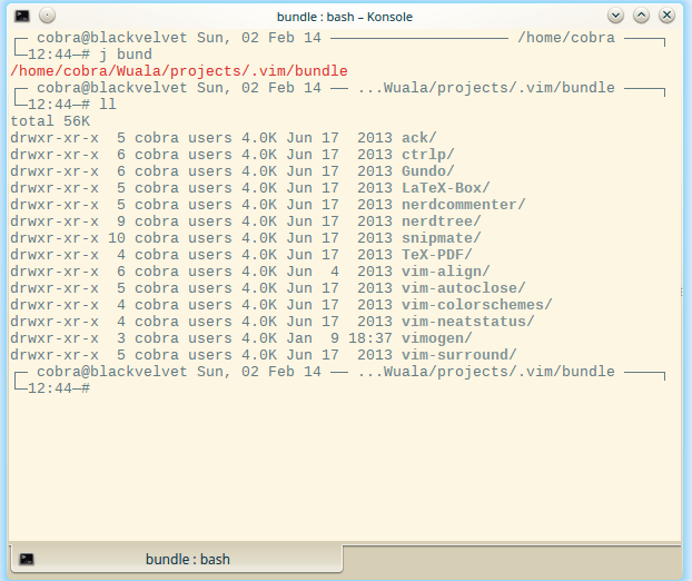
Have a look: that's konsole on KDE 4.12 with the default Monospace (which is actually DejaVu Mono) font and the 'solarized-light' color scheme. The screenshot additionally illustrates the use of autojump and displays all of my vim extensions handled by vimogen.


konsole

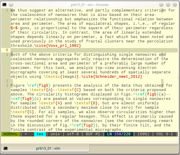
Talking about vim: here's vim itself displaying a paper I've just submitted. The vim color scheme is 'solarized-light' as well.


vim

Other great fonts for the terminal include Consolas from Microsoft, Monaco from Apple, and the free font Inconsolata.

Weather

I like to have a weather forecast right on my desktop instead of having to to look it up on one of these overcrowded and ad-riddled weather pages or (heaven forbid!) having to switch on the TV. When I switched to conky, I thus integrated a forecast into the main conky display using conkyForecast.

A few weeks ago conky stopped forecasting, and I soon discovered that the conkyForecast script had been abandoned long ago.

Detailed information of the current weather can be obtained easily with a few lines in your .conkyrc: just query http://weather.noaa.gov/pub/data/observations/metar/stations/EDDT for one of the keywords 'last_update', 'temperature', 'humidity', 'pressure', 'wind_speed', 'wind_dir', 'cloud_cover'.

For example:

Temperature: ${alignr}${weather <http://weather.noaa.gov/pub/data/observations/metar/stations/EDDT> temperature}°C

A working .conkyrc implementing this query can be found in the Archlinux forum.

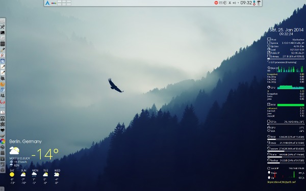
However, I get a pretty accurate idea of the current weather conditions by opening the window. What I really want is a forecast for the next days. I finally settled for an implementation querying Yahoo. I've slightly modified the original version and use it as a stand-alone conky-weather widget:

Desktop

Also note the panel with all those application icons waiting to be clickedy-clicked on the left. ¡Viva la Revolución!

Crispy

Many people complain about the font rendering in Linux distributions, and rightly so. I've never really suffered much from this problem as my visual acuity is not that perfect. 8)

Well, I was nevertheless curious and just installed the infinality bundle, a collection of freetype patches aimed to improve font rendering under Linux. The improvement is obvious even to me, and since installation is straightforward for all major distributions (Arch, Debian, Fedora, openSUSE), I'd suggest that you try it yourself.

Here's an easy-to-reproduce screenshot with an active infinality fontconfig. The small fonts used in this screenshot are indeed rendered more accurately when compared to the standard configuration. As a matter of fact, I can read them with less strain and even from a greater distance than before.

Infinality

The higher the resolution of the display, the more obvious is the improvement. On the Mini with its 133 dpi, letters look essentially like printed. For even higher resolutions, subpixel-hinting and eventually antialiasing itself gradually lose their impact, but from what I've read you'd need at least 300 dpi to arrive at the point to render these techniques obsolete.