
Growth
Every now and then I pick up Indy and step on our balance to check his weight. The results are displayed in the figure below.
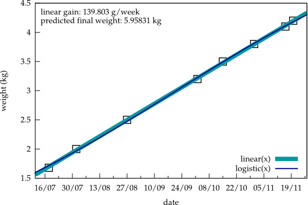
The thick, light blue line is the result of a linear fit, revealing a weekly weight increase of about 140 g. A deviation from linearity is not yet apparent. That's why the second fit by a logistic function (thin dark blue line) and the resulting prediction of a final weight of about 6 kg is not very accurate at the moment.
Here's the gnuplot script generating this figure:
set terminal svg size 600,400 dynamic enhanced fname 'palatino' fsize 12 solid
set output 'indyweight.svg'
set xlabel "date"
set ylabel "weight (kg)"
set xtics nomirror
set ytics nomirror
set style line 1 ps 1.5 pt 4 lc -1
set style line 2 lw 8 lc 8
set style line 3 lw 2 lc 6
set key right bottom
set xdata time
set timefmt "%d.%m.%y"
set xrange ["11.07.11":"27.11.11"]
toffset=strptime("%d.%m.%y","18.07.11")
linear(x) = a + b*(x-toffset)
c = 5; d = 0.1; e = 3e-9
logistic(x) = c/(1 + d*exp(-e*(x-toffset)))
fit linear(x) "/home/cobra/Documents/indy" using 1:2 via a,b
fit logistic(x) "/home/cobra/Documents/indy" using 1:2 via c,d,e
gain = 1000*7*24*60*60*b
finalweight = c
set label "linear gain: %g g/week", gain at graph  0.02, graph  0.95
set label "predicted final weight: %g kg",  finalweight at graph  0.02, graph  0.9
plot "/home/cobra/Documents/indy" using 1:2 notitle with points ls 1, linear(x) with line ls 2, logistic(x) with lines ls 3
Update: For some reason, webkit-based browsers such as Chromium don't handle the particular svg above correctly, but add huge upper and lower margins. I thus have replaced it for the moment with a png.